The website
I developed a website that allows you to see the worldwide death rates by country for all causes of death classified by the WHO, using data taken directly from their website.
You can see age-standardized and crude death rates. The site also includes indicators for data quality, allowing users to assess the reliability of the statistics.
How did we get here?
This project might seem… grim? But there’s a logical (if not exactly cheerful) sequence of events that led me to create it.
Threads
I hate threads.
Every time I visit that godforsaken app, I leave fuming over the dumbest things. I rarely go there voluntarily—usually, I’m just scrolling through Instagram when a shocking post grabs my attention, and I can’t resist checking the comments.
Some time ago, that post was this:

TranslationThe sign says “Tall +1.80 Salary of +100thousand who takes care of things, anyone?”
Whenever I see posts like this, I check the comments to see if people are mocking it. To my surprise, most replies take it seriously. One user even wrote a lengthy AI-generated analysis. At the end of that thread, one reply stood out:

TranslationIn fact, a robot like the drawing or the ones in sci-fi isn’t necessary, a year or two ago there was a news segment about young people in Japan (both men and women) no longer forming relationships because they had virtual or robotic pets for companionship along with other products to satisfy their sexual needs.
My first thought was: “It’s not like people in Japan are happy about that—suicide is a big problem there.”
But then I hesitated: “Wait, is that actually true? I’ve heard it before, but I’ve never verified it.” So I decided to check.
Research
Like most research these days, I started with a Google search (unless you use AI, in which case the AI starts with a Google search).
Wikipedia had an entry exactly for this called List of countries by suicide rate, but the most recent data was from 2019, with a note that it needed updating.
NOTEIf you check now, you might find updated data. I planned to update it after finishing this project, but someone else beat me to it the same day I published the site.
Next, I visited World Population Review’s Suicide Rate by Country 2025. The article was well-presented with clear explanations, but I was skeptical. I looked up opinions on the site’s reliability and found mixed reactions—mostly complaints from people who disagreed with specific data points. Worse, two of the article’s three sources were broken, and the third one required an account which I didn’t want to create.
The third site I checked was Statista’s Suicide Rates Around the World. They had a nice-looking graph with a bold title, but my problem was this: it only covered select OECD countries. At the time, I didn’t even know what the OECD was - turns out it’s mostly wealthy nations, leaving out huge parts of Africa and Asia where suicide rates are actually highest.
This bothered me because graphs like these get shared everywhere while quietly pushing a false narrative - that suicide is mainly a first-world issue. The reality (which I found in the WHO data) is that most suicides occur in low- and middle-income countries. When you title something “Around the World” but exclude three-quarters of it, you’re not informing people - you’re misleading them.
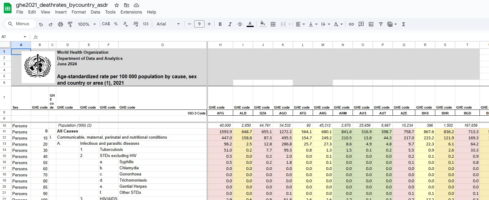
Frustrated, I went straight to the source: the WHO’s Global Health Estimates. There, I downloaded spreadsheets like this:

Buried in the data, I found suicide rates. You can now view this on my website on section III.B.1.
Analysis
In the crude death rates, Japan ranks #17 for highest death rates by suicide. But there’s a reason suicide is perceived as a bigger issue there than in higher-ranking countries. Many top-ranking nations face more pressing crises like poverty and war, making suicide a secondary concern. In Japan, however, suicide is the leading cause of death for men aged 20–44. This isn’t just a numbers problem—it’s a cultural one. Raw comparisons strip away crucial nuance.
So why did I build a site that facilitates such comparisons? Because I realized this flaw while writing this article, and the site was already finished. Oh well.
Website development
The site was built with React + TypeScript and Material UI.
I chose a layout where users select a cause of death and view a country-by-country comparison over time—exactly what I wanted when I started this project.
A Python script processes the WHO’s spreadsheet data into JSON files for the site.
The frontend uses:
- Material UI Rich Tree View for cause-of-death selection.
- Material UI Table for data display.
Initially, I only included crude death rates because I misunderstood age-standardized metrics, assuming they were less reliable. After reevaluating, I added both.
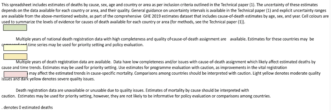
At first, I also ignored the WHO’s data quality indicators. Then I noticed this in the spreadsheets:

Despite the poor formatting, the message is clear: comparisons involving low-quality data should be treated cautiously. Most rankings omit this caveat. By including these indicators, I hope to make users more aware of the pitfalls in comparing imperfect data.
